

'The Light Keeper' Linocut Print
Wordhord
'Britain's Birds' National Trust
Country Matters

Wisdom of Sheep
Nightwalking (German Cover)
Serpent, Siren, Maelstrom & Myth

Cowshed Christmas
'Short Philosophy of Birds' Penguin Random House

'The Stubborn Light of Things' Faber & Faber
'Feathertide' Ebury Books

Haoma
Duvet Designs for Modern Dane

Folklore Society Gin

'Wolf Hall Companion' Pavilion Books

Boffin Bookplates
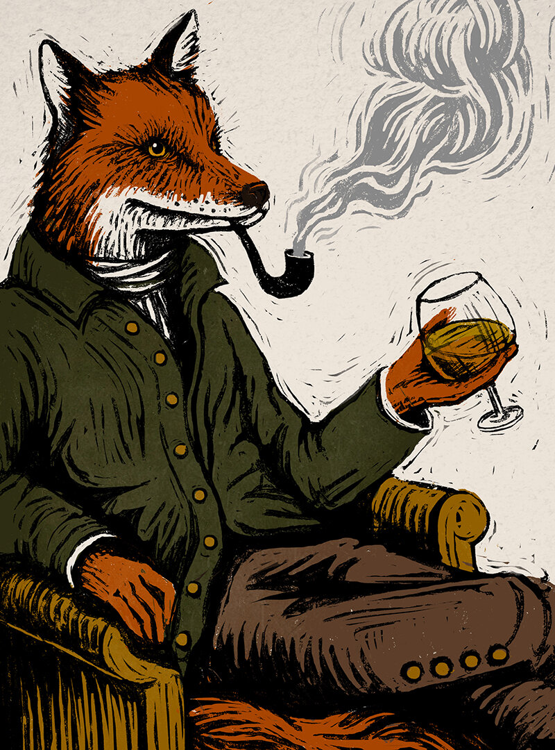
Dapper Fox
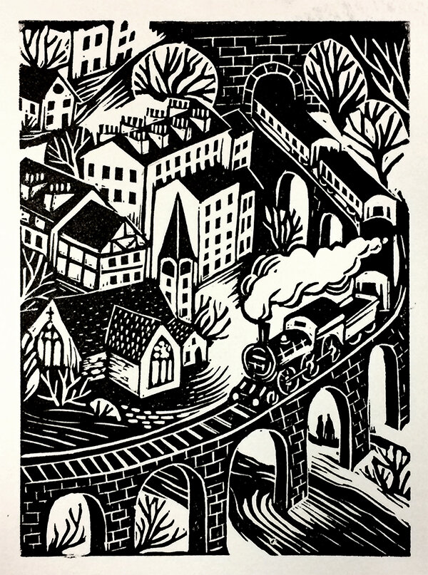
Steam Train

Ministry of Donuts
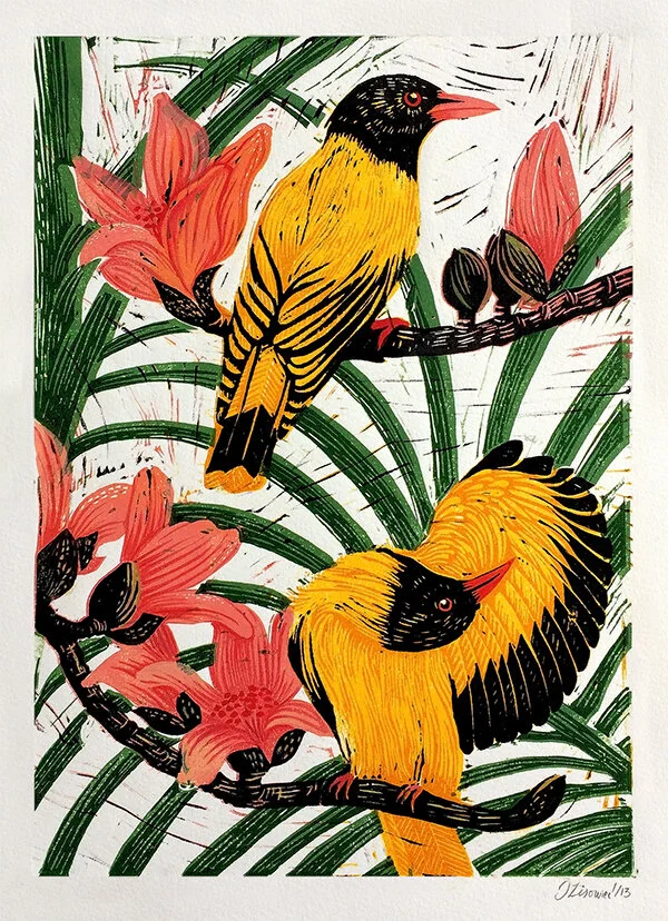
Golden Orioles
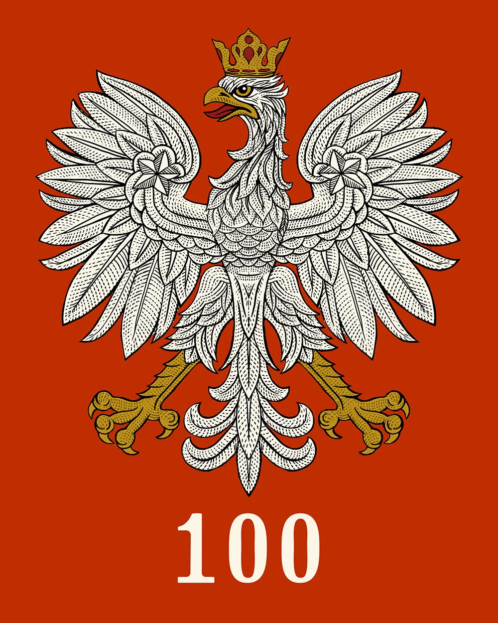
Polish Independence

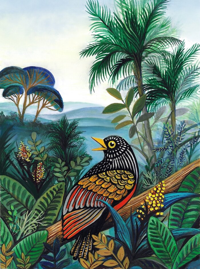
It's a Jungle Out There

Lettering

Book Lover's Britain

Roadie Brew

Gin Maker's Kit
Breaking the Silence

Winter
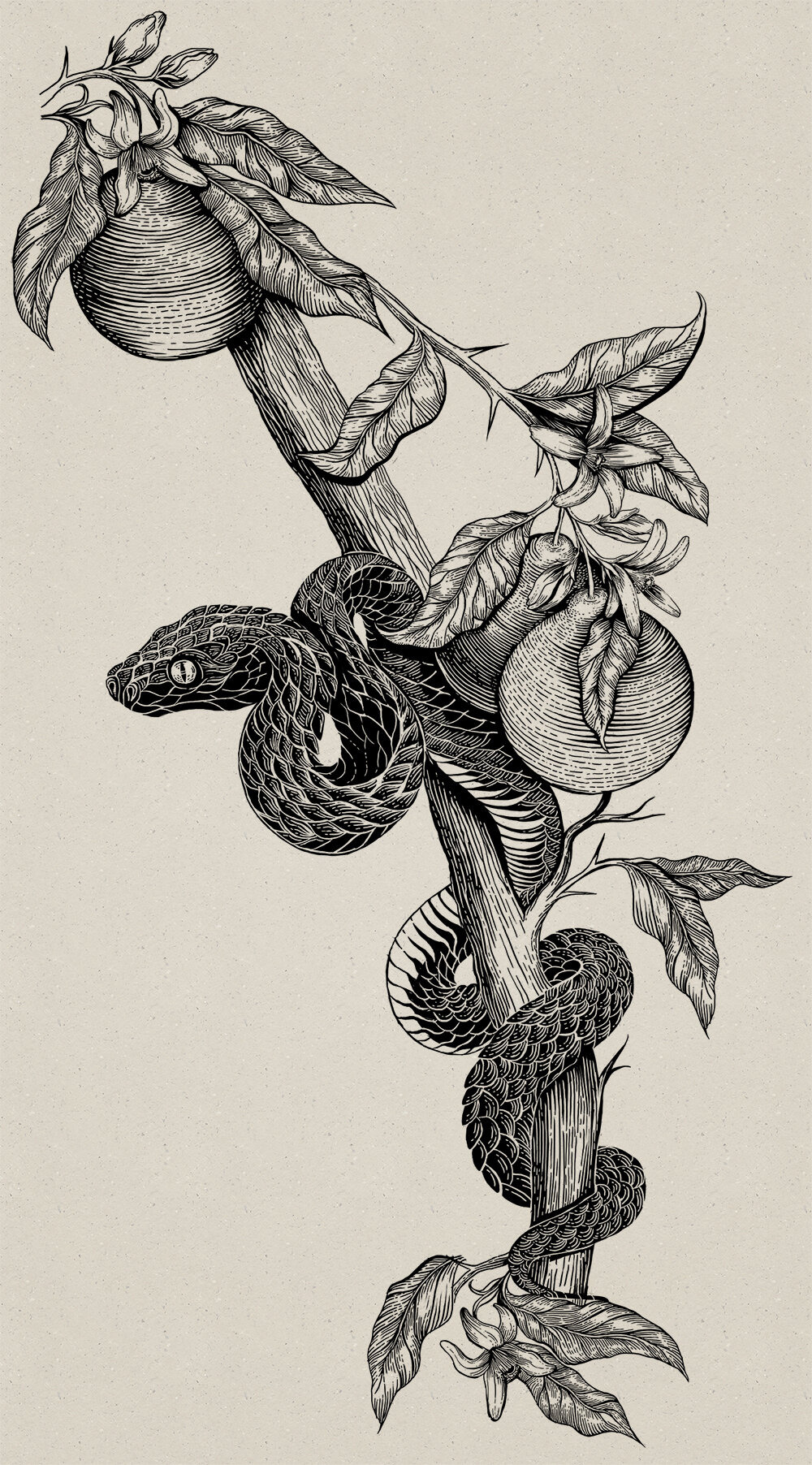
Forbidden Fruit

High & Low

Harbour Kitchen

Alps

Maple Cabin
